Honeymoon Fundraiser

Selected project

Wedding

PROJECT

Campaign, Visual identity, Print

TAGS

Moodboard
Deliverable
The moodboard was curated by pulling together images found online. This was the final decision after trimming down from five other choices, narrowing in the aesthetic. Though the colors and fonts changed in the design stage, this visual communication tool helped ground the design process.
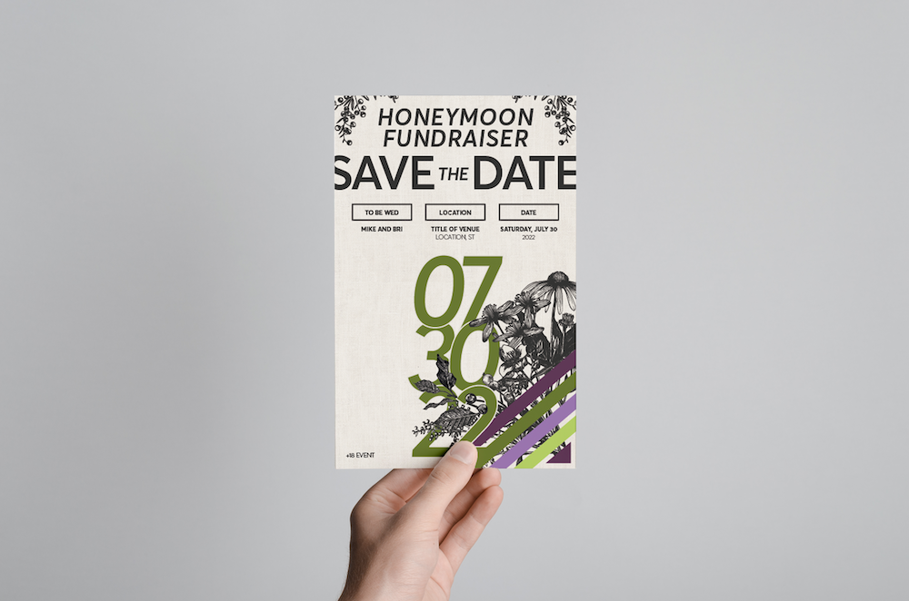
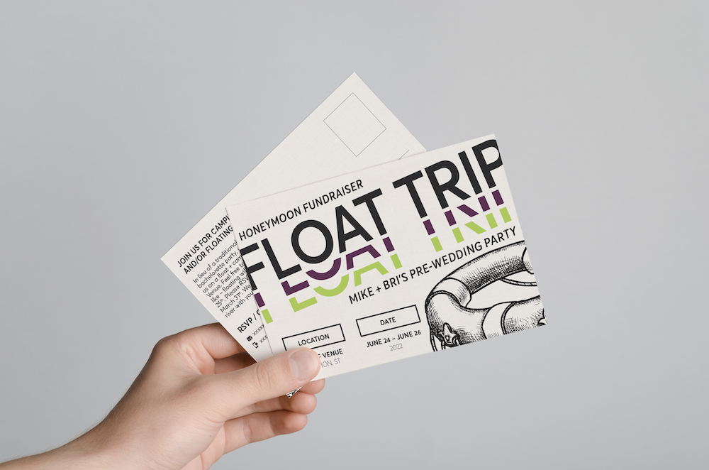
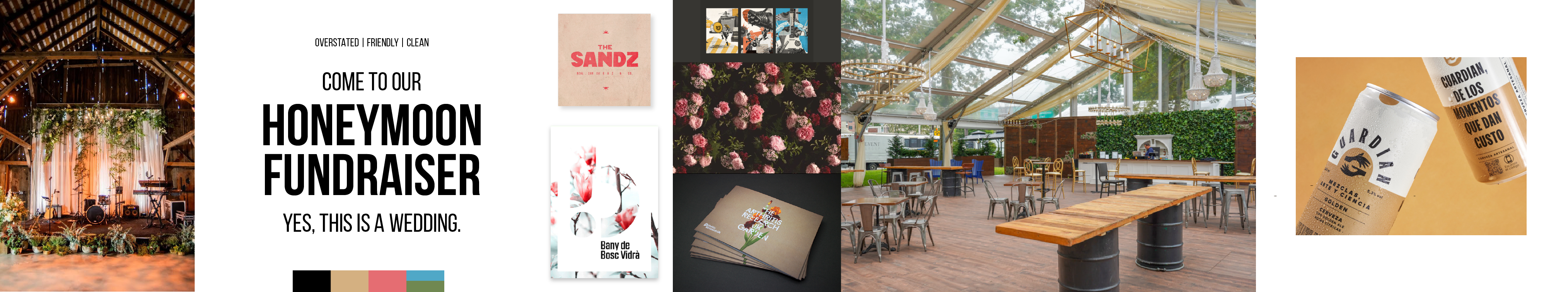
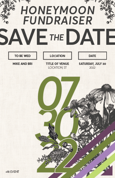
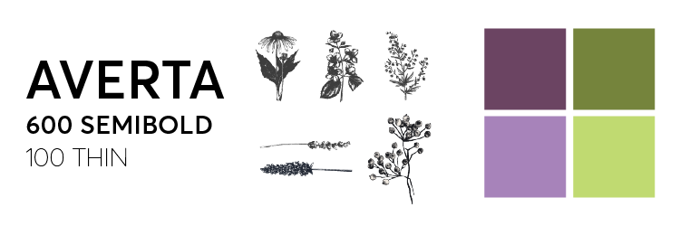
Typography, assets, and colors
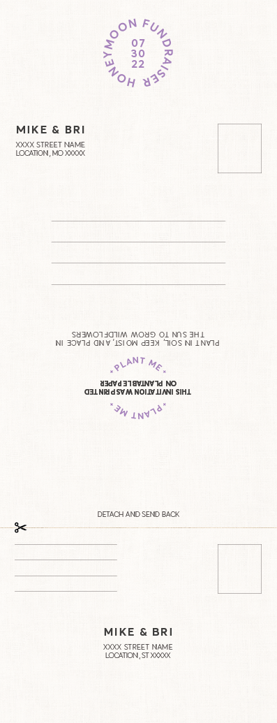
Deliverable
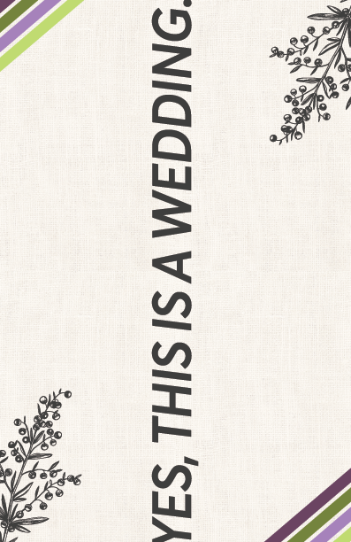
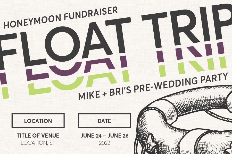
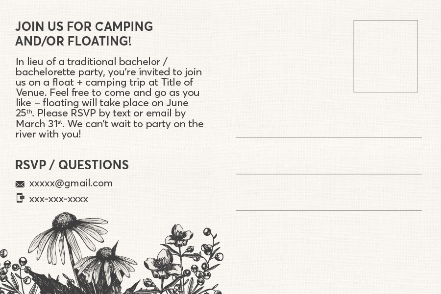
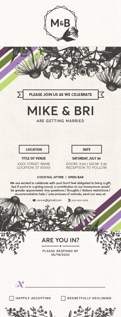
Shutterstock assets, typography, and colors were chosen next. The colors matched the wedding colors that Bri and Mike had chosen, so the consistency ran all the way through to the big day. We also decided on a subdued burlap texture to add a hand-crafted feeling.
Save the Date
Deliverable
This is where the design formally found its footing. We used the burlap texture for the background, and started using the stripes, the oversized text, and the illustrated wildflowers. The client and I both loved how it came together.
Pre-Wedding Party
Deliverable
Next was a "pre-wedding party" invitation, in lieu of a traditional  bachelor/bachelorette party. This design could be less formal, and instead emphasize the fun elements of the design identity.
Invitation
Deliverable
The final design was the wedding invitation, which was the most formal piece in the project. The invitation was printed on compostable paper embedded with wildflower seeds.